Design Objective: For this project, everyone in my class was randomly assigned a letter, for me that letter was E. Each week, on Monday we would be given a word as our prompt to theme the drop cap around for that week. On Wednesday, we were to come in with at least 6 sketched out concepts for our letter, in class it would be decided which of these sketches we would continue with. From there we had until the next week to finalize our drop cap. The only stipulations were that we were required to render our letterform in Illustrator, after that we were allowed to add as many colors, textures, or effects as we wanted in whatever method we wanted. The requirements for the final drop cap were rather open, allowing for experimentation with things such as GIFs, After Effects, or AI tools.
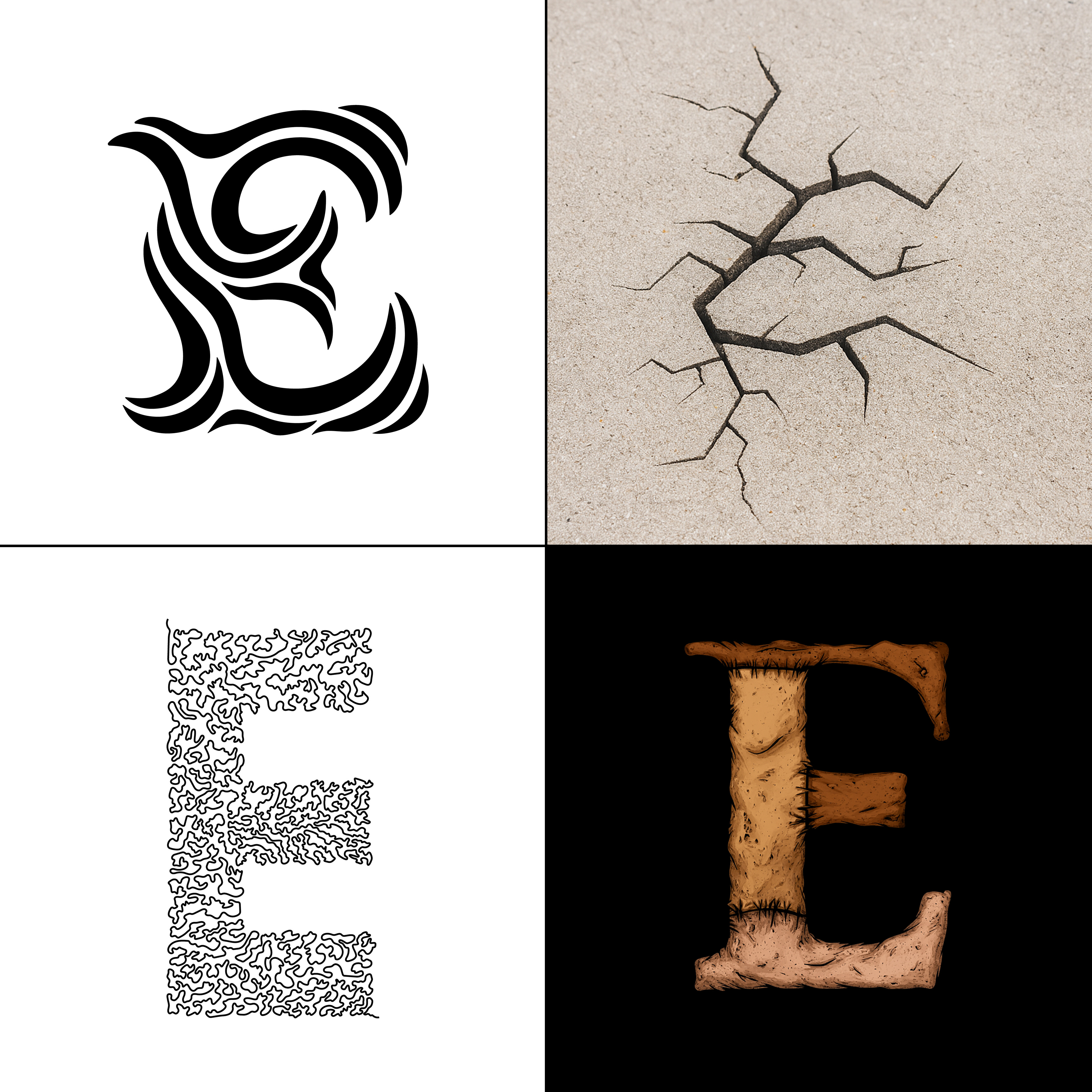
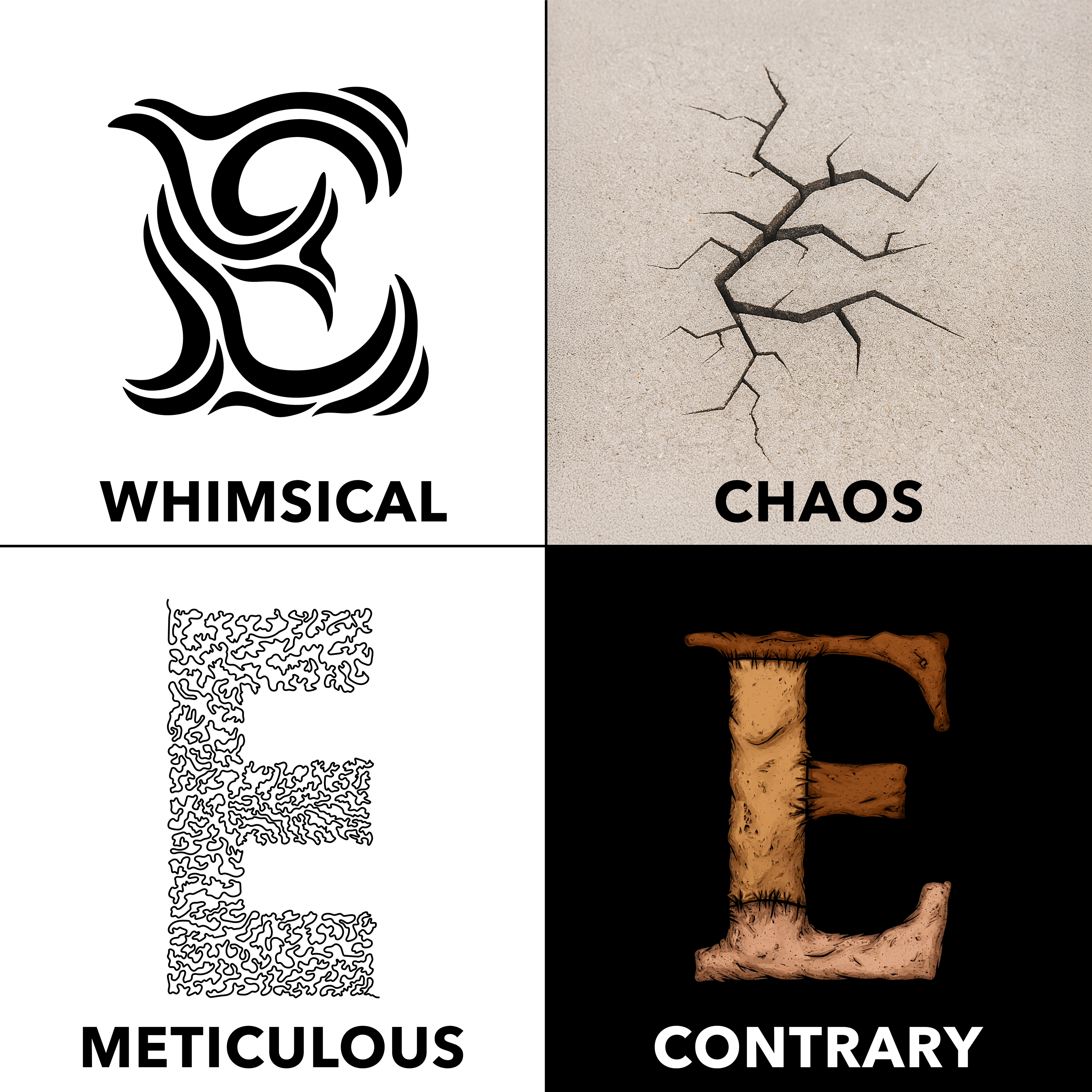
WEEK 1: WHIMSICAL
As with any project, I began with word listing and sketching. Admittedly I did not do enough for this first round. This is a lesson I will learn from for the following weeks.
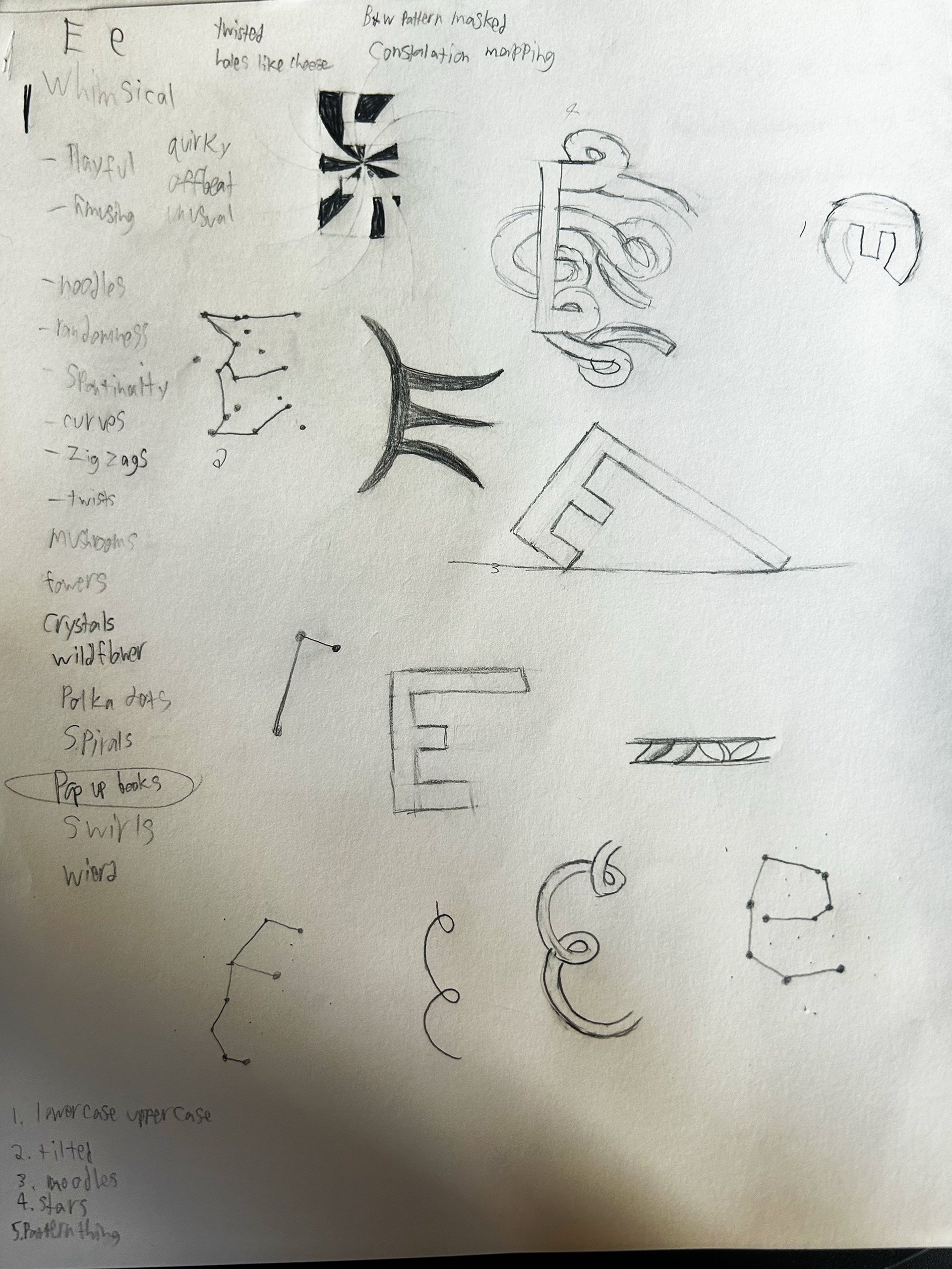
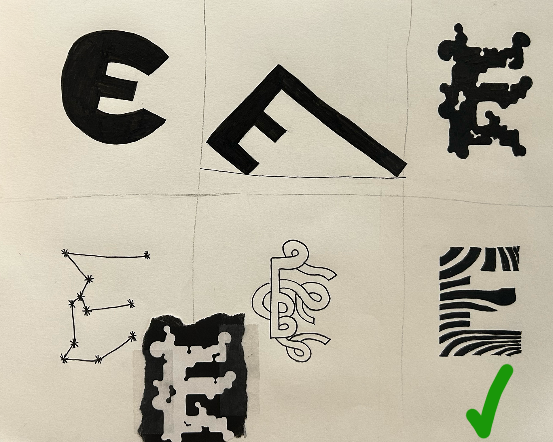
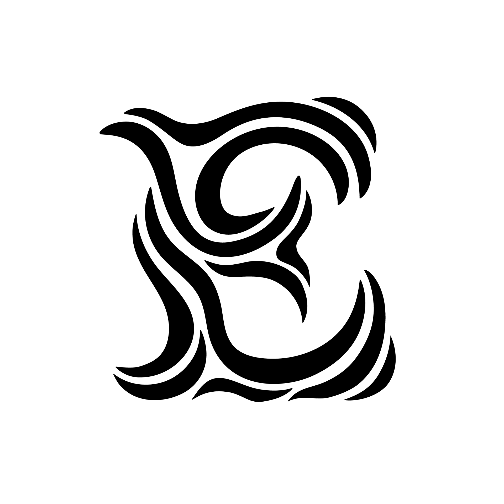
From my six sketches turned in, the one on the bottom left, a sort of wavy pattern was chosen. This is the beginning of what could be noted as a pattern, the chosen drop cap was the one which I was the least excited about, I will admit, it was sketched as a solution to fill my sixth spot, I had not planned for it to be the one which would be chosen.
Next I sat down with some paper, pencils, and markers and started trying to bring out the whimsy with my sketches. After trying out various different ideas I settled on one of my sketches. Then I built it out in illustrator, before making a few iterations and settling on the final design.
WEEK 2: CHAOS

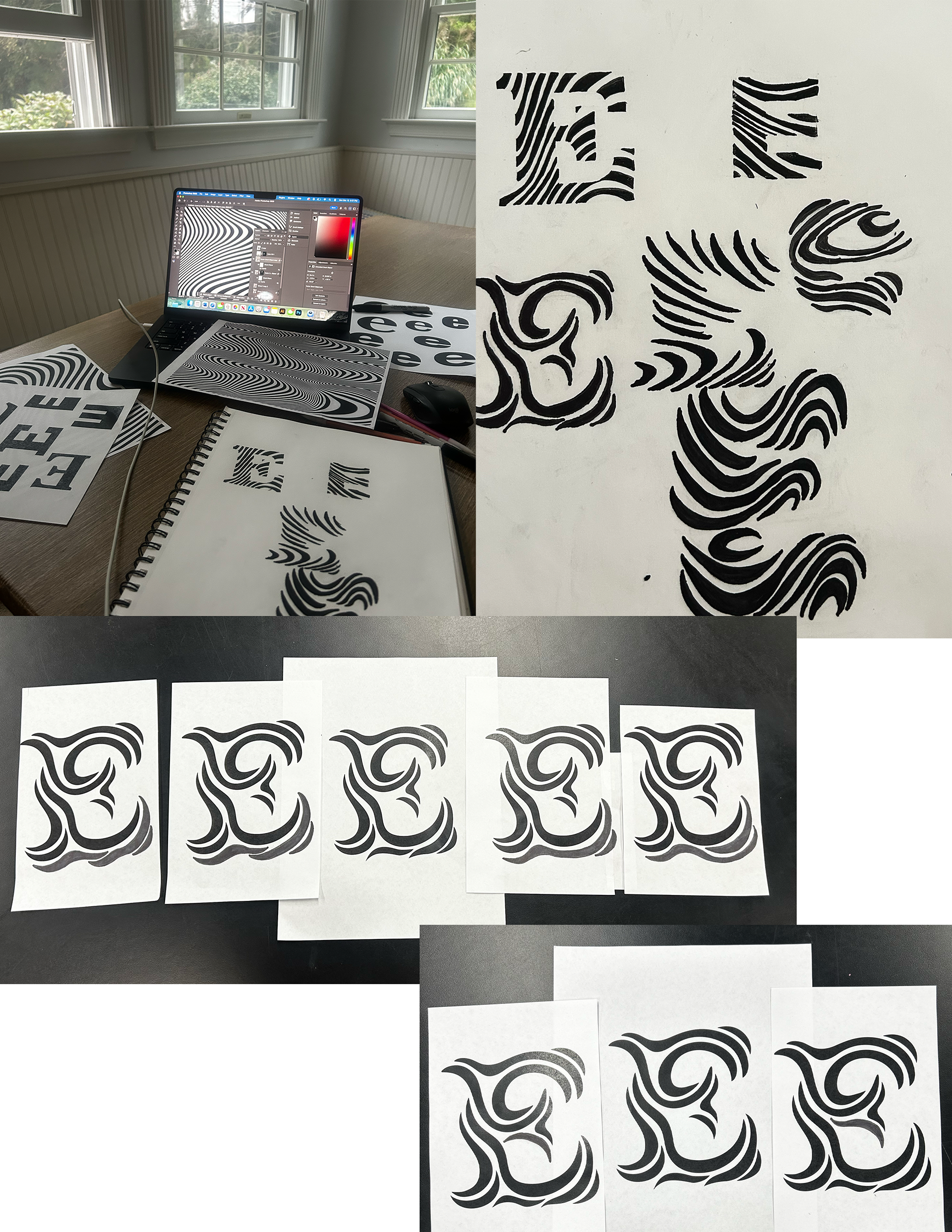
As always, I started by sitting down and word listing. I made sure to give myself more time to do this than the previous week and I also sketched much more.
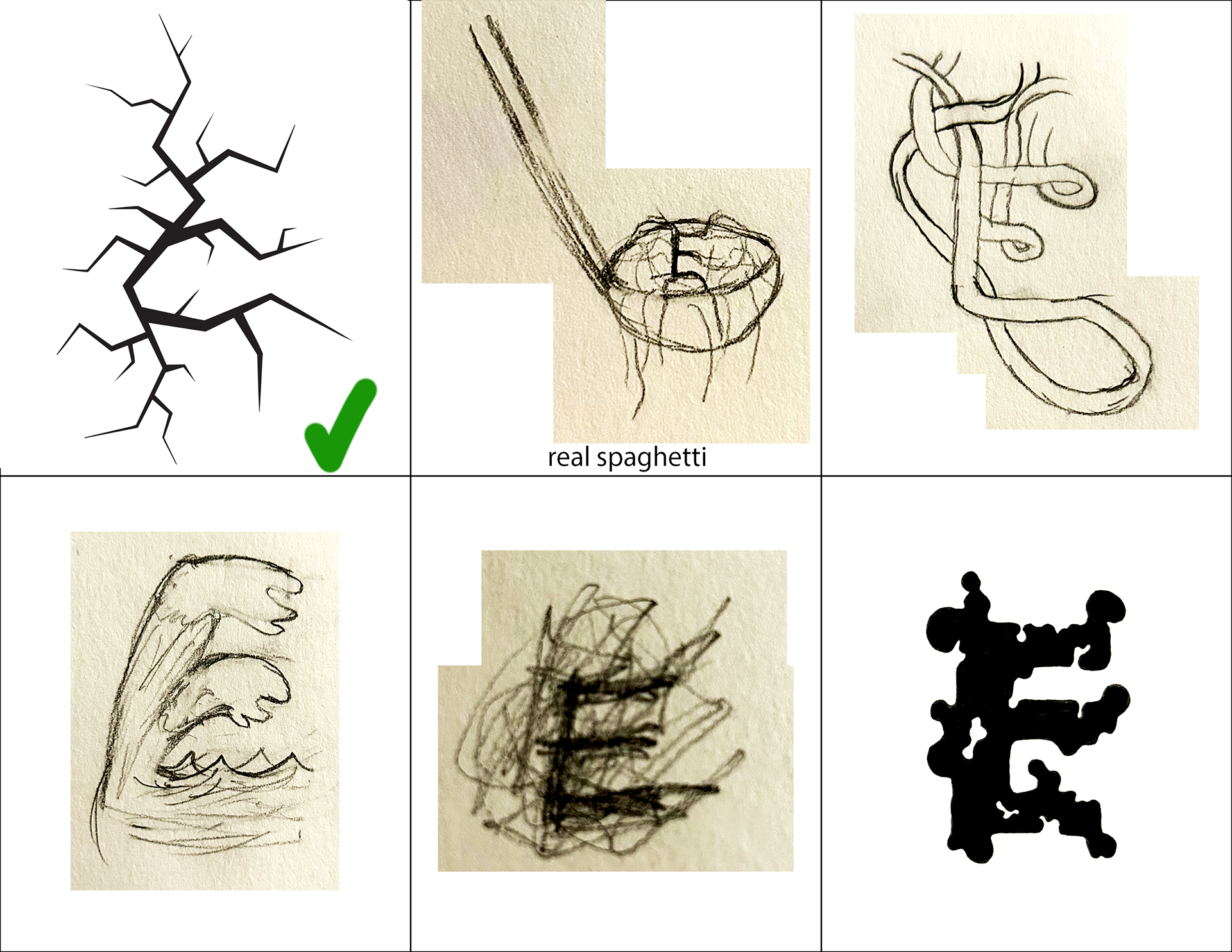
This time I spent a bit more time coming up with 6 concepts that I was more pleased with. From the six sketches turned in, the one on the top left, a sort of shattered/cracked idea was chosen. There were a few this round I would have been happy with and this time one of them was chosen.
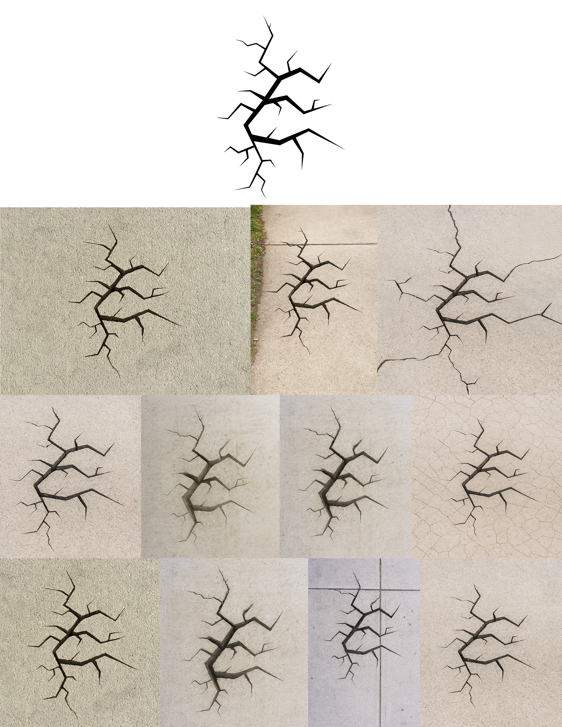
For this week, because I had already built out my sketch in Illustrator to get a better idea of how it looked, I was already part way there. I did some minor adjustments to make sure that the letterform was still legible while adhering to the chaotic nature of the prompt, before settling on the final vector of my drop cap.
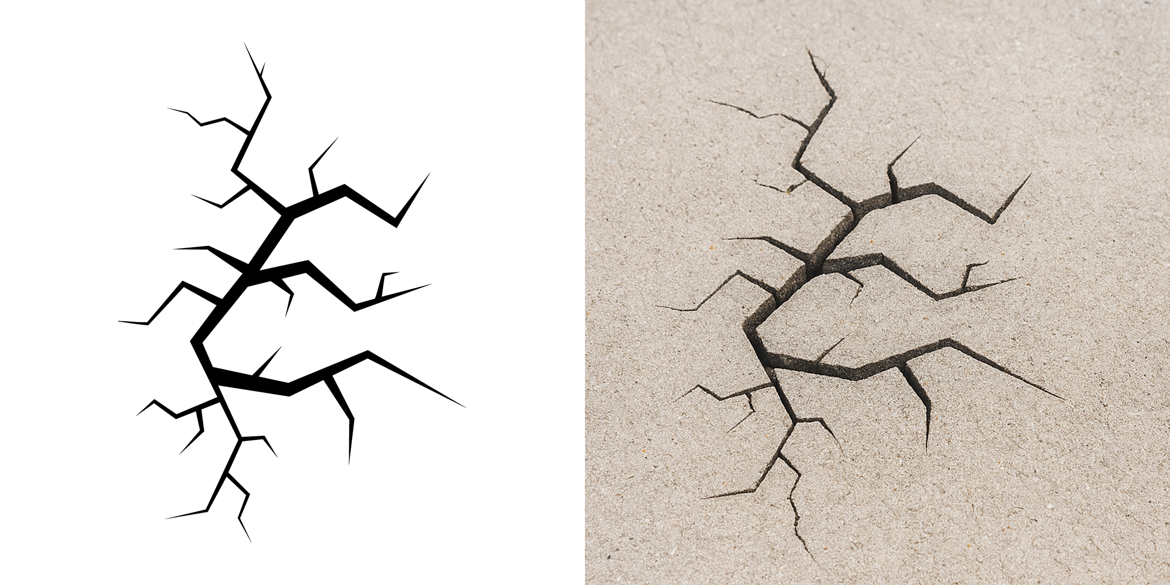
I then tried out multiple AI programs with variations of the request: “use this shape to create an image with a crack in the sidewalk”.
A small sample of those variations at attempting to get the best version of the image:
“use this shape to create an image with a big crack forming in the sidewalk in this shape the sidewalk should be rather plain with no lines going through it”
“use this shape to create an image with a big crack forming in the sidewalk in this shape”
“a few changes, can there please not be lines on the sidewalk, also can the crack look like its going deep, I don't really want to be able to see what's underneath”
I did this for a little while before settling on an image I was mostly happy with. I then did a few light edits in photoshop before turning in my final Drop cap for this week.
WEEK 3: METICULOUS
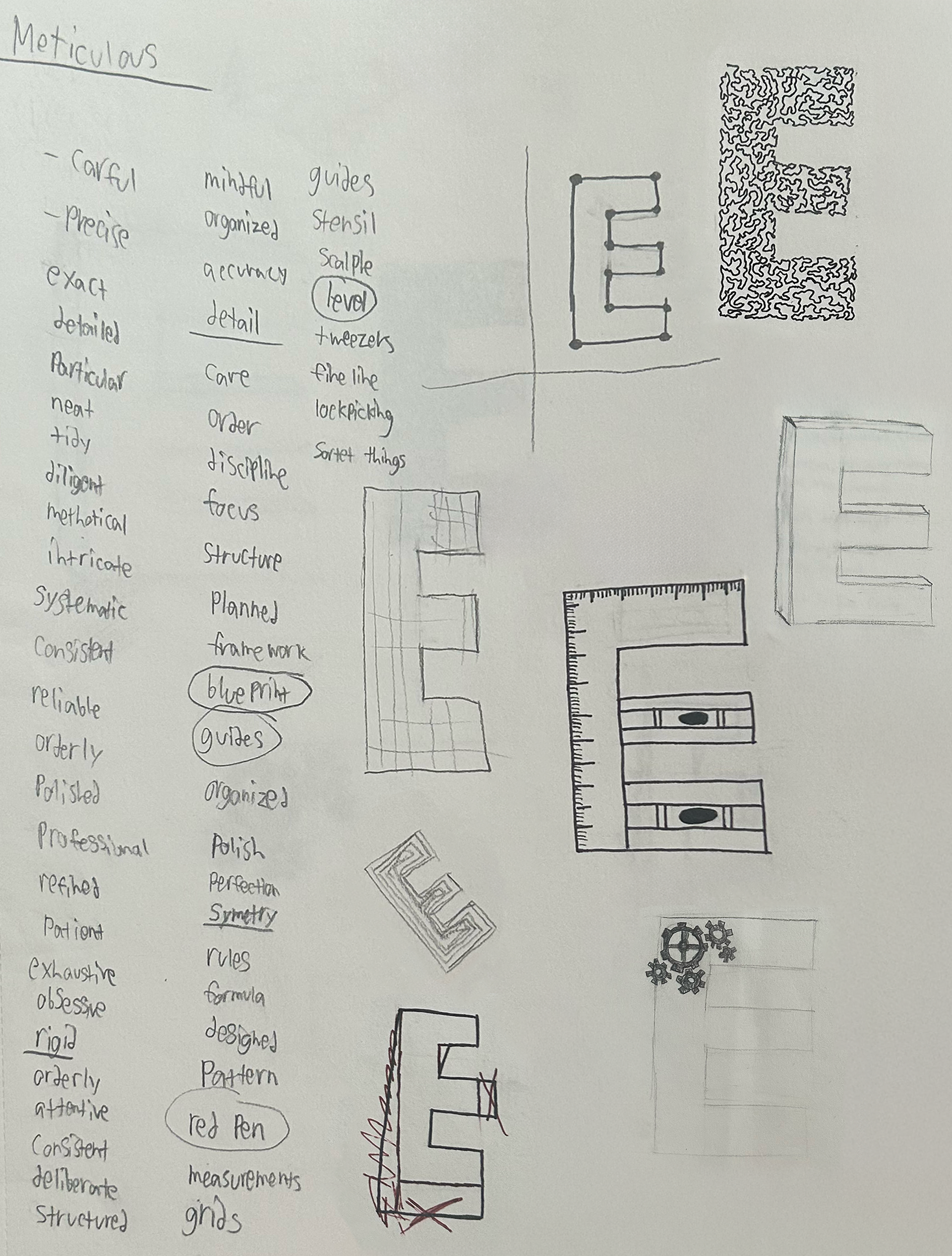
Once again, I sat down to wordlist and sketch. I liked this one, Meticulous is sort of in the opposite direction of the first two weeks; whimsical and chaotic, this time it my thinking was more structured and rigid than the previous weeks. I went on and did some sketching that would lead into my final 6 concepts, though I also did a few more digitally, as I felt that was the most time efficient way to get some of my concepts across.
This time, for the 6 concepts I turned in, I was generally happy with most of them, there were some lesser so than others but I felt I knew which two sketches it would be between.
but as with week one, I was somewhat surprised and disappointed with the concept that was chosen, maybe putting the concept I was least excited about at the top center didn't help, but regardless, that was the one that was chosen.
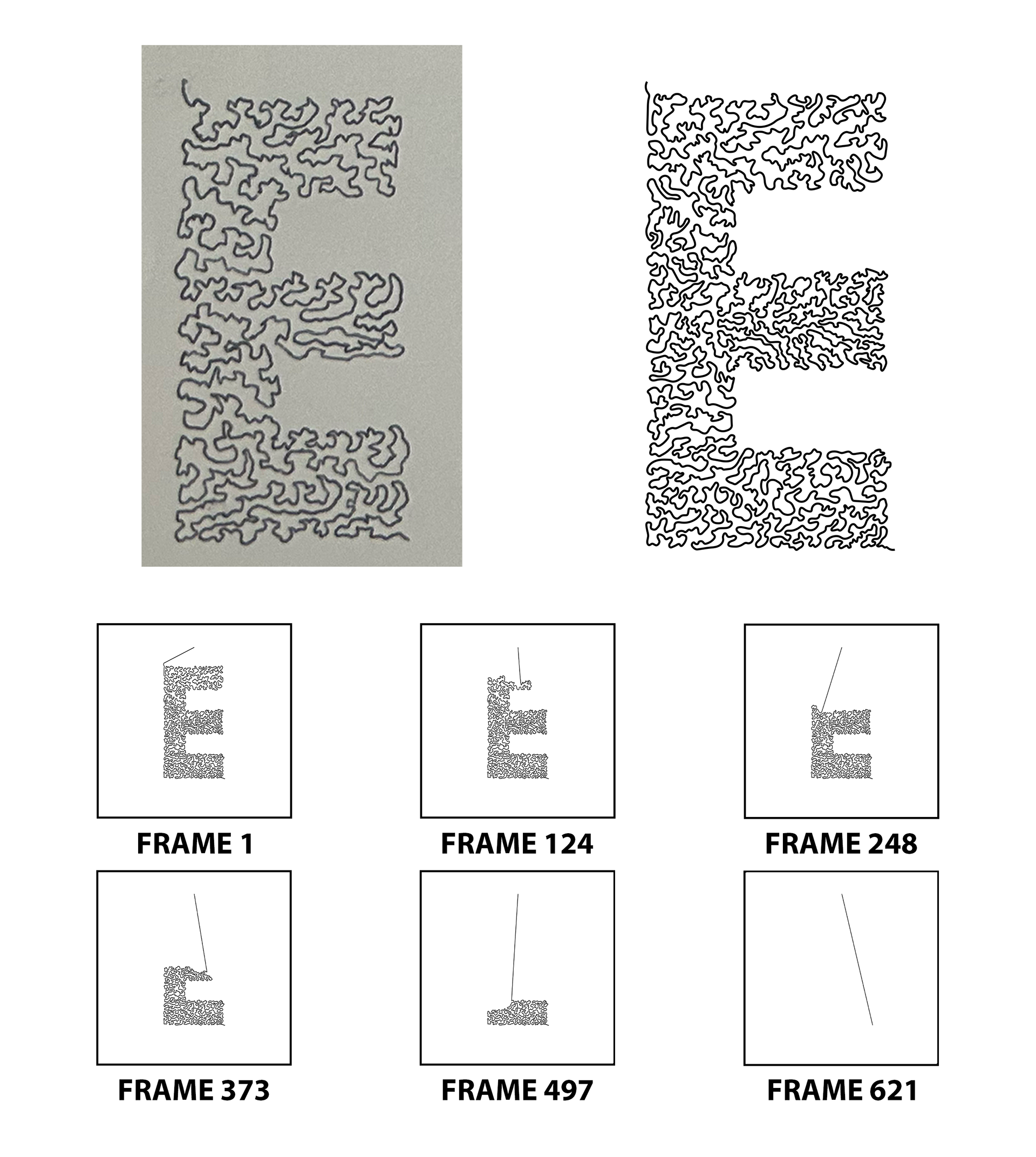
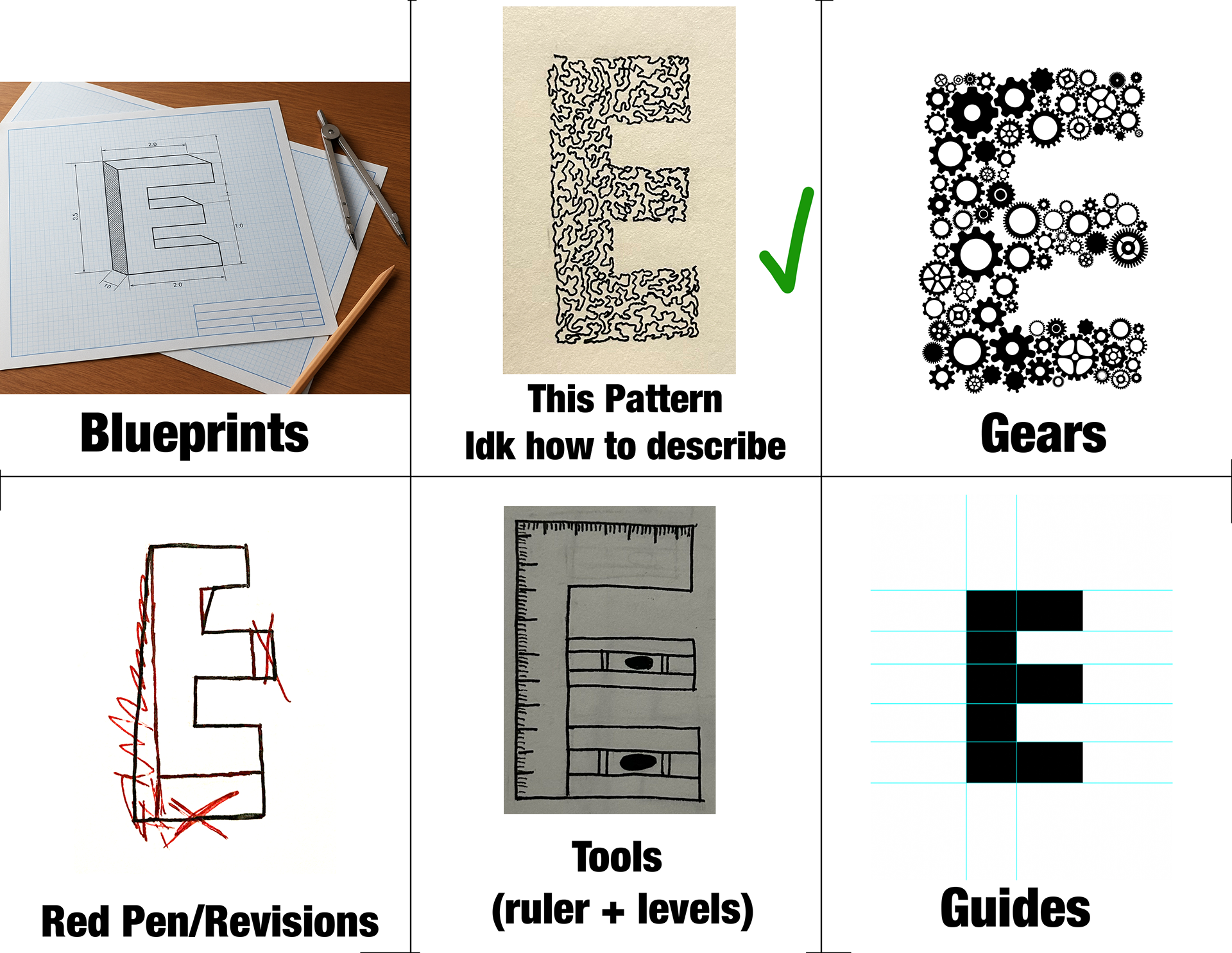
For this week, I found myself frustrated with my drop-cap as it felt rather boring to me, I found myself somewhat in the same place I was in during week 1. For this reason, I decided to explore how I might be able to push this concept further.
Though unintentional, the process for creating this drop-cap became highly meticulous. First I went ahead and made a new sketch, which I then brought into illustrator and replicated. I had a very limited amount of experience using photoshop to animated, so I thought I would use this as a chance to try that out a bit more. I decided I would have this drop-cap be stop motion animated to look as if it was unraveling. to create this animation, I went frame by frame, removing a few points at a time. Because I had created this drop-cap to be very detailed, there were a ton of points for me to go through removing. By the time I had finished this process, I had exported a total of 622 individual frames. I then brought all 622 frames into photoshop to set up the stop motion animation. I reversed the animation so that it looked as if it was being created rather than taken apart, and then sped it up, as the original animation with all of its frames came out to about 22 seconds, and then I also turned it into a GIF.
WEEK 4: CONTRARY
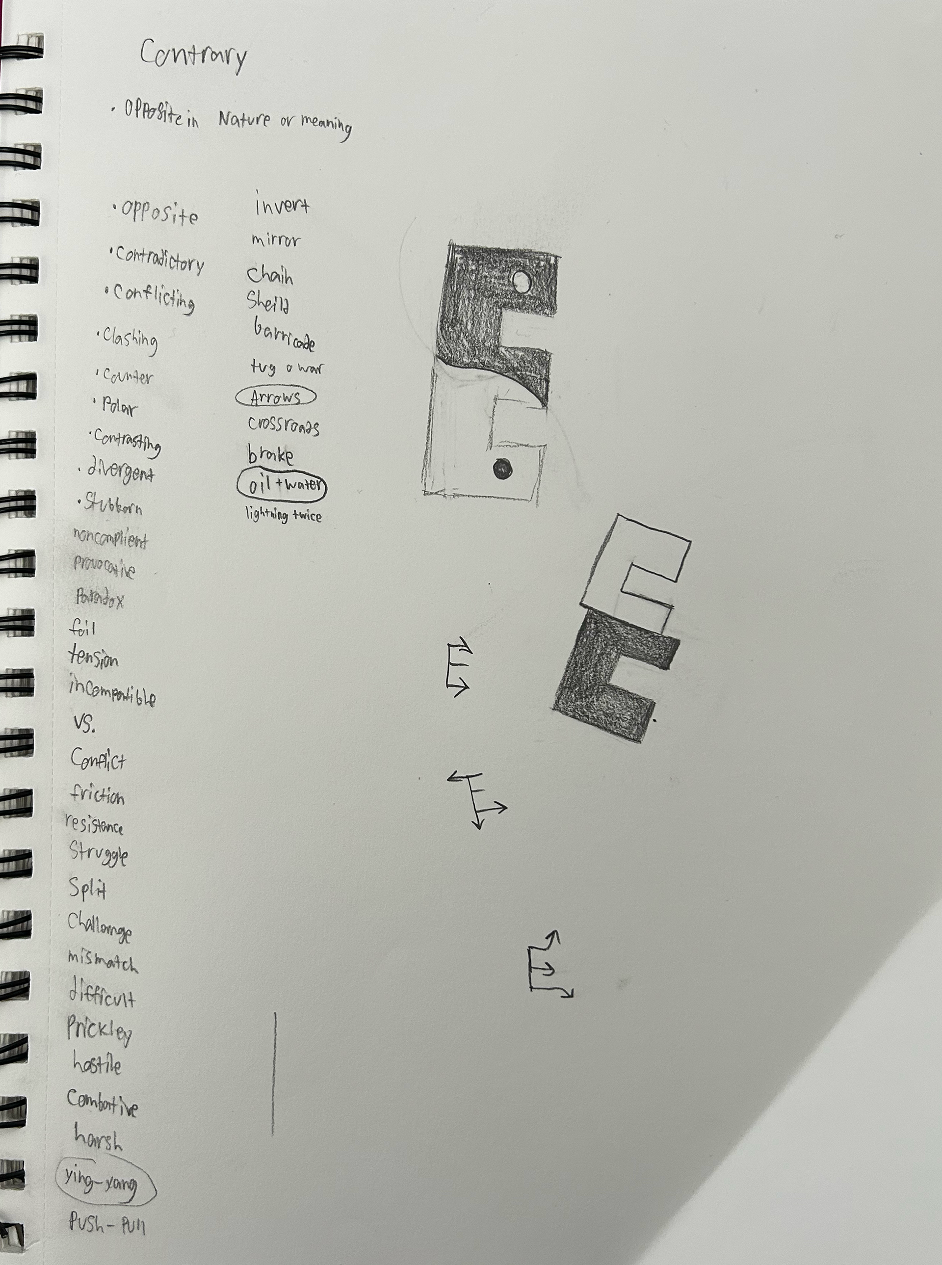
Once again I started out with word listing and a bit of sketching. This was one of the more difficult weeks, contrary got somewhat mixed up with contradictory and it became a bit tough to differentiate.
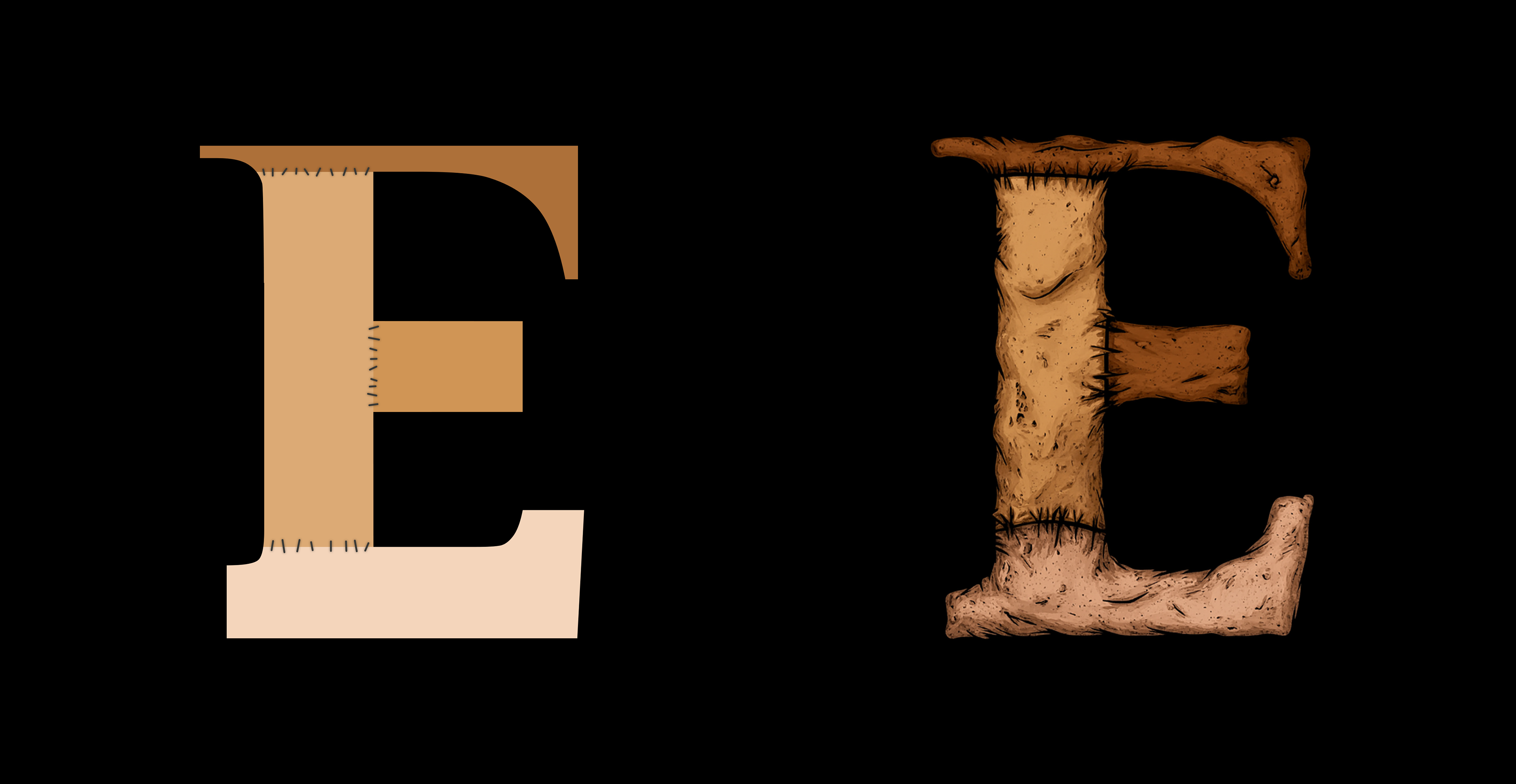
From my 6 concepts, the chosen one was this amalgamation of different fonts. It used pieces of serif, sans serif, and slab serif fonts to create a funky new letterform. When deciding between sketches in class, my professor referred to this concept as frankensteined together typefaces, this idea didn't necessarily reinforce the idea of the theme contrary, but I felt that it was something which could push the final drop cap further.
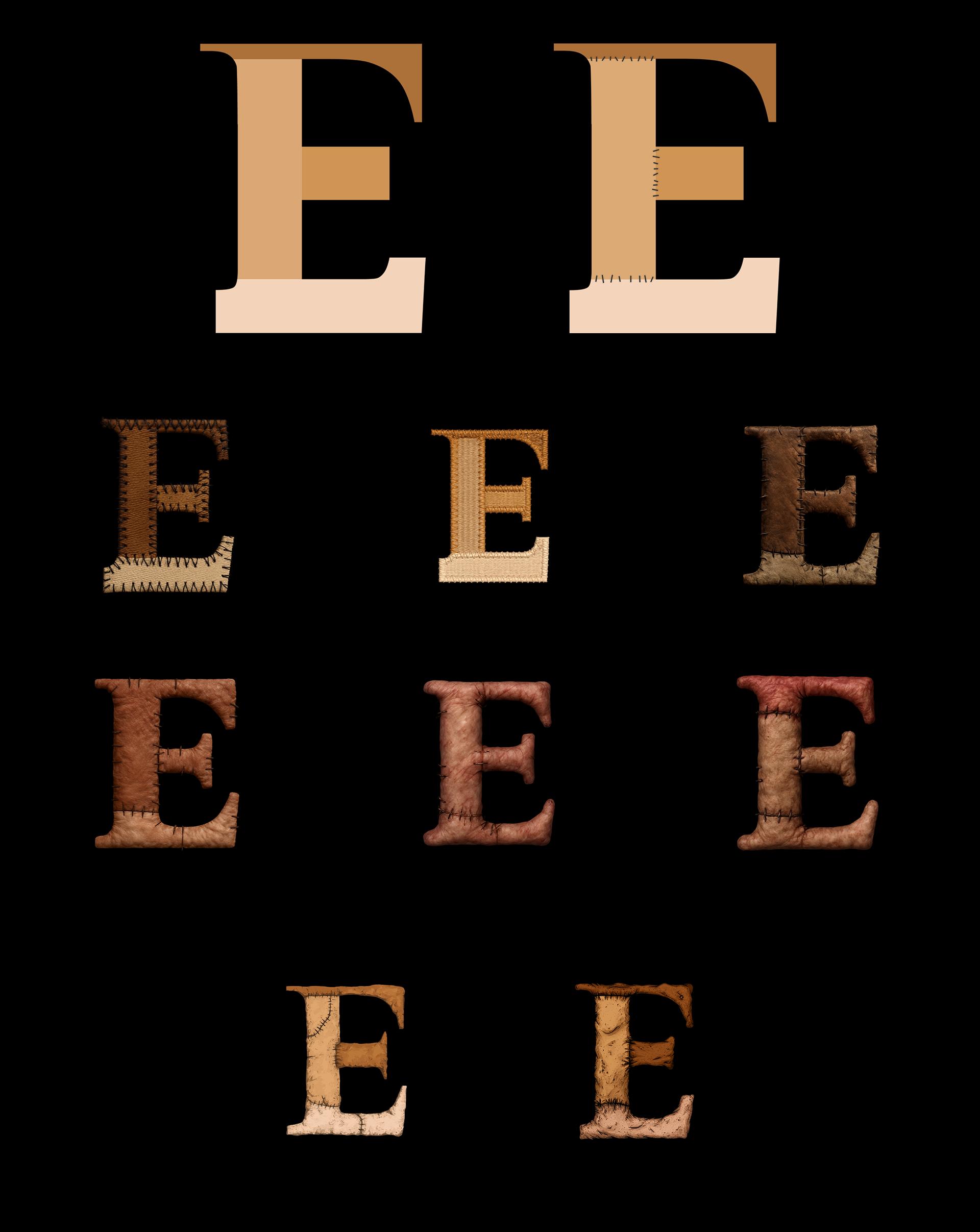
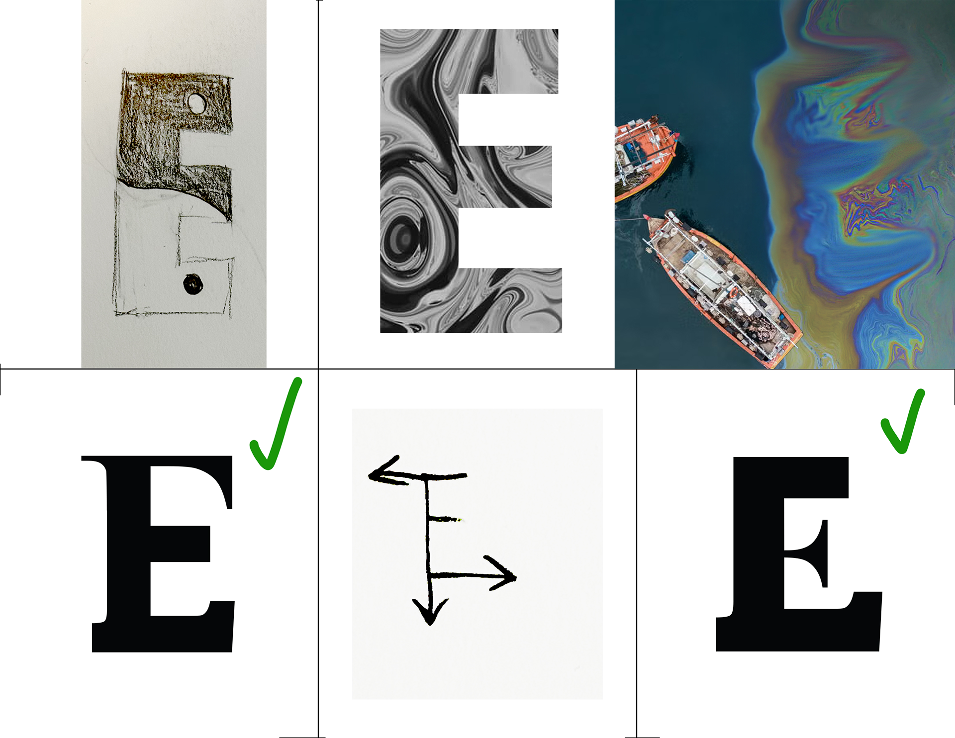
For this drop cap I decided I would embrace that Frankenstein concept. I began my going back to that sketch where I had stitched different typefaces together and a colored each separate piece that I used with a different skin tone to make it feel as if each piece was brought from a separate source. I then went and added some stitches on at the seams of the different pieces, keeping with that Frankensteining concept.
After doing that, I decided to try out using AI with this drop cap as well. I was imagining a sort of gory, fleshy look. First, when asking to stitch the different pieces together like Frankenstein, it went in a sort of sewing direction, things resembling leather, felt, and woven baskets.
When I asked more specifically for it to look like skin, I received a sort of illustrated depiction, it what not quite what I had in mind, but did look interesting.
I then, tried using prompts to push it further in a gory, photorealistic Frankenstein direction. These likely because of restrictions of AI imagery and gore, as well as just its ability at this time, didn't quite come out in a satisfactory way.
I went back to the sort of illustrated render of the Frankenstein flesh. It wasn't the realists gross look I had pictured, but something about it appealed to me. I went in and did a few touch ups, as the process of rendering it to look like flesh began to add serifs in on the middle bar where there were to be none, and then I had my final drop cap for week 4.
So at the very end of the project, I had four drop caps, each with a different prompt behind it.